A New Reverie: From Software to Sanctuary

Something was bothering us.
Reverie had great characters. Meaningful conversations. Features that users genuinely loved. But every time we looked at the interface, we saw... software. Buttons, cards, lists, navigation bars. The kind of clean, functional design you'd expect from a productivity tool or a SaaS dashboard.
That's not what Reverie is supposed to be.
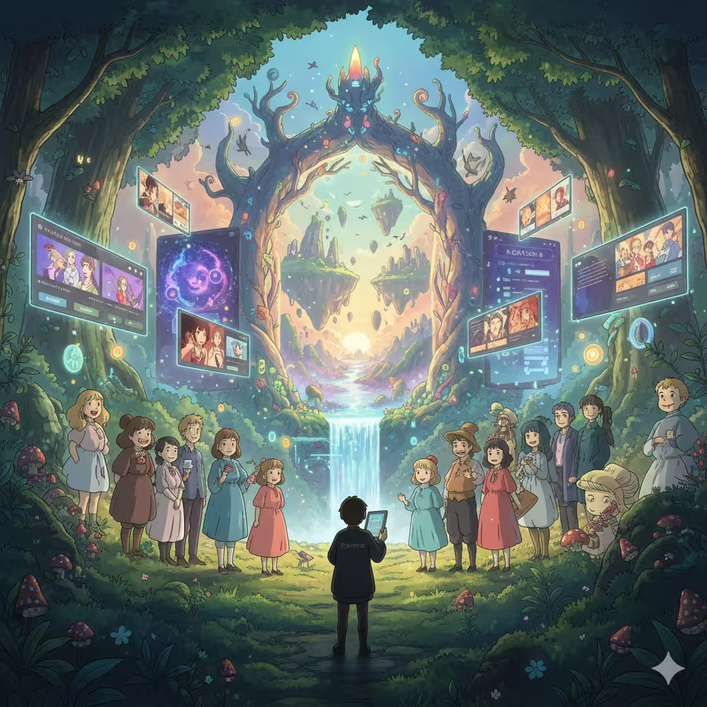
Reverie is a place where imagination comes alive. Where you meet characters who feel real, step into stories that respond to you, explore worlds that exist just for your experience. The product was magical. The interface was mundane.
So we rebuilt everything.
The Problem with "Good Enough"
Our old design wasn't bad. It was professional, consistent, easy to navigate. It followed best practices. Users could find what they needed.
But "good enough" is the enemy of memorable.
When you use most apps, you're aware that you're using an app. There's a mental layer between you and the experience—the interface constantly reminds you that you're a user operating software. Click this button. Navigate to that page. Complete this flow.
We wanted that layer to disappear.
The best entertainment experiences don't feel like products. When you're absorbed in a great film, you forget you're watching a screen. When you're lost in a novel, the pages vanish. We wanted Reverie to feel the same way—a place you enter, not a tool you use.
What Changed
Every major page has been redesigned around one principle: characters and stories come first, interface comes second.
Home: A Gallery of Possibilities
The old homepage was functional. Featured characters in a grid. Categories to browse. Clear calls to action.
The new homepage is an experience. A four-column gallery of character images fills the screen, creating a mosaic of possibilities. Gradient overlays and a subtle radial glow effect draw your eye to the center, where a search box and quick-access tags invite exploration. Below, featured stories scroll in cinematic 21:9 aspect ratio cards—hover over them and they come alive with video.
The moment you land on Reverie, you're not looking at a website. You're looking at worlds waiting to be explored.
Login: Where Characters Welcome You
We threw away the blank form on a white background. Now, when you sign in, you're greeted by characters themselves.
On desktop, the screen splits: the left side becomes a full-bleed character showcase—images and videos rotating every five seconds, each character's name and bio appearing at the bottom. The login form sits on the right, but your attention is drawn to the characters inviting you in.
On mobile, the character fades into a soft background behind the centered form, still present, still welcoming, but never competing for focus.
It's a small touch that changes everything. Logging in no longer feels like authenticating with a service. It feels like coming home.
Character Pages: Portraits, Not Profiles
Character detail pages used to look like profiles—information organized in sections, stats displayed in boxes, description text in paragraphs.
Now they're immersive portraits. The character's image or video fills the entire screen. Hover on desktop and the image becomes clearer, scaling slightly as if the character is stepping forward to meet you. On mobile, images are crisp by default—no hover needed.
Action buttons (rating, favorite, share) tuck into the top-right corner, present but unobtrusive. The character's name, bio, and stats appear at the bottom, layered over the image with careful typography. The CTA buttons float in the center with a subtle radial glow, inviting you to start a conversation.
You're not viewing a character's data. You're meeting them.
Story Pages: Cinematic Covers
Stories now present themselves like movie posters. The cover image dominates the viewport, with the same hover-to-reveal clarity effect as character pages. Rating and share buttons sit quietly in the corner.
At the bottom, the story's title, description, stats, and tags are arranged with purpose. The play button is integrated right into the hero—no separate section, no visual break. Everything flows toward a single invitation: step into this world.
Tabs below are refined with backdrop blur and subtle borders, making the transition from hero to content feel seamless rather than jarring.
Discover Feed: A Curated Experience
The old dashboard was a list you scrolled through. The new discover feed is a curated experience you explore.
Featured stories appear in a horizontal carousel with that same cinematic 21:9 ratio. Videos play on hover. Quick actions—Continue Chat, Continue Story, Create Character, Write Story—sit in a compact pill bar, always accessible but never dominating.
The whole experience encourages discovery rather than searching, wandering rather than hunting.
Campaigns: Events That Feel Special
Campaign pages now open with immersive hero sections that make each event feel like an occasion. Countdown timers are integrated inline—no more sidebar widgets breaking the visual flow.
Creator profiles got the same treatment. When you visit a creator's page, you're greeted by an immersive header that celebrates their work before diving into details.
The Philosophy Behind It
We drew inspiration from places that understand immersion:
Streaming platforms know that content should sell itself visually. You browse with your eyes before you read descriptions.
Visual novels understand that characters need context. The world around them matters as much as who they are.
Game launchers recognize that entering an experience should feel like crossing a threshold. The interface sets the mood before anything begins.
Movie theaters go dark so the screen can glow. The environment amplifies the experience.
We applied these lessons everywhere. More visual real estate for images and videos. Darker, more atmospheric backgrounds. Gradient overlays that create depth without hiding content. Hover effects that make static images feel alive. Typography that enhances rather than competes.
What We Kept
Redesign doesn't mean starting over. Some things worked perfectly:
- Navigation clarity: You can still find everything easily. We didn't sacrifice usability for aesthetics.
- Mobile-first approach: Every change works beautifully on phones, where most users are. Mobile gets clearer images by default, optimized interactions, responsive layouts.
- Creator tools: All the functionality creators need is still there, just presented more elegantly.
- Performance: The new design is actually faster. Larger images, but smarter loading. Video only plays when needed.
The Details That Matter
Some changes you might not consciously notice, but you'll feel:
- Images extend beyond their containers in places, breaking the grid to feel more alive
- Gradient overlays that shift on hover, revealing more of the image beneath
- Videos that play automatically when you hover, adding motion without requiring clicks
- Scale effects that make elements feel responsive to your attention
- Backdrop blur on UI elements that maintains atmosphere while ensuring readability
- Radial glow effects that draw your eye to key actions
- Consistent 21:9 aspect ratios for stories that feel cinematic across the platform
What This Means for You
If you're a user, Reverie should feel more inviting now. More like a place you want to spend time, less like an app you're operating. The characters and stories you love are presented the way they deserve—not as items in a database, but as experiences waiting to happen.
If you're a creator, your work gets a better stage. Your characters appear in full-screen glory. Your stories get cinematic presentation. The tools you need are still accessible, just not competing with your content for attention.
This is Just the Beginning
This redesign establishes a new foundation. A visual language that puts imagination first. An interface philosophy that prioritizes immersion over information architecture.
We'll keep building on this. More pages to refine. More moments to polish. More ways to make Reverie feel less like software and more like the sanctuary it's meant to be.
Because at the end of the day, you don't come to Reverie to use a product. You come to escape, to connect, to imagine, to feel.
The interface should get out of your way and let that happen.
Explore the new Reverie. We'd love to hear what you think—share your thoughts on our Discord.
Ready to Experience Dynamic AI Conversations?
Join thousands of users already exploring infinite personality and engaging interactions on Reverie.