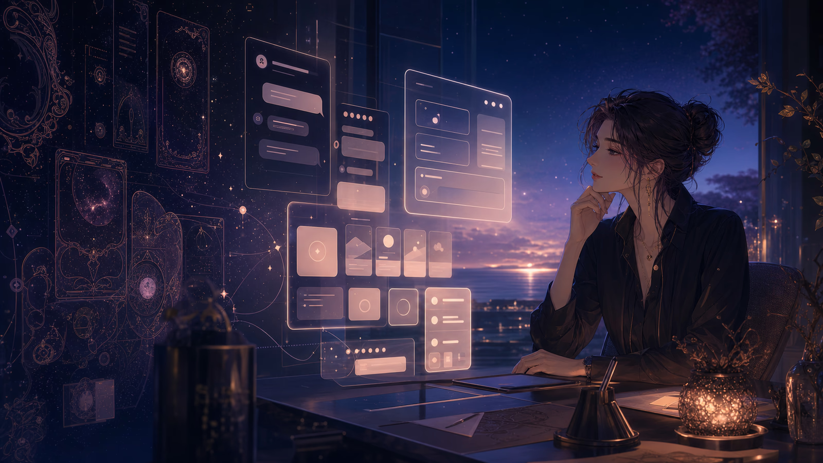

If you have opened a conversation in the past few days, you may have noticed that something feels different.
The chat interface became a little quieter. Messages were easier to read. Controls felt lighter. Panels and dialogs no longer competed as much with the conversation itself. Nothing moved to an unfamiliar place, but the space around your characters started to feel calmer.
Chat was where we began because it is where many people spend the most time in Reverie. It was also the best place to test the question behind this redesign: what should the interface feel like when it needs to stay comfortable for an entire conversation, not just make a strong first impression?
What you saw there was not an isolated refresh. It was the first visible part of a new design system, and we have now extended that system across the whole product—from discovery and character pages to creation tools, stories, payments, rewards, settings, and the small utility screens between them.
Reverie has always been expressive.
That personality showed up everywhere: strong borders, visible shadows, layered cards, colorful controls, and surfaces that wanted to feel like objects rather than rectangles on a screen. It gave the product warmth and made it recognizably ours.
But a visual language can be right for one stage of a product and become too heavy for the next.
As Reverie grew, the interface had to support more than discovery. People were spending longer inside conversations, managing characters, writing stories, comparing plans, configuring advanced tools, and moving between increasingly complex workflows. The same decorative details that gave a landing page character could become visual noise when repeated across every dialog, card, menu, and button.
So we did not redesign Reverie to make it less distinctive. We redesigned it to make the distinction come from the experience itself.
A Lighter Interface, Not a Colder One
"Lightweight" can easily become a synonym for plain white backgrounds, thin gray text, and components with so little presence that everything starts to feel unfinished. That was never the goal.
The new system is quieter, but it is still warm.
We shifted the canvas away from stark white and toward softly tinted neutral surfaces. Text is darker and slightly stronger where sustained reading matters. Borders are more restrained, shadows are shallower, and color is used with greater intention. The result is less visual weight without losing the sense that Reverie is a place made for stories and relationships.
This balance mattered especially in roleplay. A conversation is not a settings dashboard. People read long messages, notice subtle changes in tone, and often stay in the same view for a long time. Typography and background color need to feel comfortable after twenty minutes, not just look clean in a screenshot.
Typography That Holds Up to Long Reading
One of the most important changes is also one of the least dramatic: we strengthened the type hierarchy.
Large headings remain expressive, but body copy now carries more visual confidence. Important labels, navigation items, and actions use weights that are easier to scan. Secondary text is still secondary, but no longer so faint that reading it feels like work.
The principle is simple:
- Long-form text should feel calm and substantial.
- Actions should be recognizable before you read every label.
- Supporting information should recede without disappearing.
- A page should remain legible across different displays, themes, and ambient lighting.
Good typography does not ask for attention. It makes attention easier to sustain.
One Component Language Across the Product
This was not a page-by-page reskin. We rebuilt the shared component language underneath the product.
Buttons, cards, dialogs, menus, tabs, form controls, tables, tooltips, toasts, drawers, popovers, and navigation elements now share the same rules for:
- corner radius
- border contrast
- surface color
- elevation
- focus indication
- hover and pressed states
- text weight
- spacing
- semantic color
That consistency matters more than any single visual choice. When the same kind of action looks and behaves the same way everywhere, users spend less effort interpreting the interface. A destructive action feels destructive. A selected option feels selected. A floating surface feels separate from the page beneath it. A primary action is easy to find without every button competing to be primary.
We also introduced clearer semantic variants for actions such as highlighted and successful states. These are part of the shared system now, rather than one-off gradients or custom colors recreated inside individual features.
The Hard Part: Finding the Exceptions
Updating a button component does not automatically update every button.
Products accumulate local decisions over time: a pricing card with its own border, a reward dialog with a custom glow, a share modal with a special background, a hidden action using a private gradient, or a feature card that recreates hover behavior from scratch.
Those exceptions are where a redesign usually starts to feel inconsistent.
We audited the product beyond the component library and brought worthwhile custom interfaces back into the shared language. That included marketing experiences, payment flows, rewards, achievements, character and story cards, share dialogs, navigation controls, empty states, banners, and less frequently visited utility screens.
Not every exception was removed. Some interfaces need a stronger identity because they communicate celebration, urgency, rarity, or status. The difference is that those moments now extend the system instead of ignoring it.
Less Decoration, Clearer Interaction
The redesign removes many effects that looked interactive without adding useful information.
Heavy shadows no longer appear on every card. Hover movement is more restrained. Gradients are reserved for moments that benefit from emphasis. Borders define structure without enclosing every piece of content in another box.
At the same time, actual interaction states are clearer:
- Selected options expose their state visually and semantically.
- Keyboard focus is easier to follow.
- Interactive cards receive consistent hover and focus treatment.
- Buttons communicate hierarchy through shared variants.
- Dialogs and menus separate themselves from the background without feeling detached from the product.
Reducing decoration gave us more room to improve feedback. The interface moves less, but it says more.
Accessibility Is Part of the Visual System
A design system is incomplete if it only describes how components look with a mouse.
During the refactor, we revisited focus rings, keyboard behavior, selected-state semantics, contrast, and interactive card behavior. Some controls now expose pressed or selected state more clearly to assistive technology. Story items that behave like links can be reached and activated from the keyboard. Focus treatment follows the same visual logic across shared controls.
These changes are intentionally subtle. Accessibility should not feel like a separate mode layered on top of the product. It should be present in the default behavior.
A Better Foundation for What Comes Next
The most valuable outcome of this work is not a particular shade, radius, or shadow. It is that the product now has fewer competing answers to the same design question.
When we build a new feature, we no longer need to decide from scratch how a dialog should feel, how an input should respond, or how a selected card should be represented. The system already provides those answers. That makes new work faster, but more importantly, it makes the resulting experience more predictable.
Consistency is not about making every screen look identical. It is about giving people a stable set of expectations so the content can change without the interface becoming unfamiliar.
What We Hope You Notice
Ideally, not much at first.
Reverie should simply feel easier to read, calmer to navigate, and more coherent as you move from discovery into conversation, creation, and account tools. Important actions should stand out sooner. Secondary controls should stop competing for attention. Longer sessions should feel less visually tiring.
The characters are still expressive. The stories are still atmospheric. The moments that deserve celebration can still be vivid.
The interface just knows when to speak—and when to become quiet enough for everything else to matter.
The new design system now reaches across the Reverie experience. If something feels especially better—or still feels out of place—we would love to hear about it in our Discord community.